

CMYK, Pantone, and RGB: Color Conversion Pitfalls and Proofing Tips
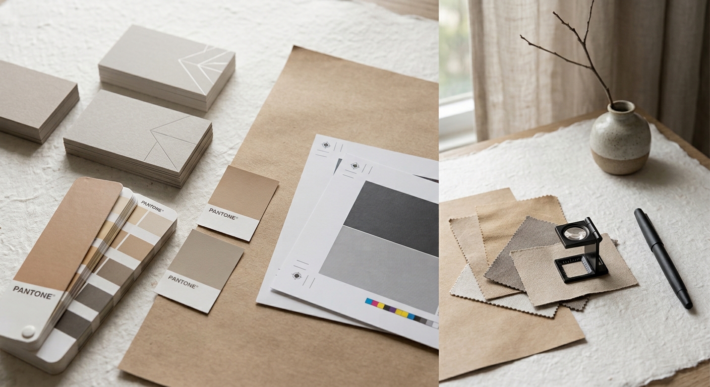
You dial in a color on screen, it looks perfect, and then the print comes back off. The bright blue turns muddy, the orange loses its punch, the logo red sits a shade too deep. That's usually not a printing error. The color shifted during conversion, before the job ever hit the press.
The cause is that three color modes were each built for a different medium. Understand how they divide the work, run a few checks before you send files, and you shrink the gap between "great on screen" and "disappointing in hand." Here's how RGB, CMYK, and Pantone relate, plus a pre-flight checklist you can run yourself.
Three Color Modes, Three Different Jobs
RGB is the language of screens, CMYK is the language of print, and Pantone is how you say "this exact color, every time."
RGB (red, green, blue) is additive: it builds color from light, which is why screens, phones, and cameras use it, and why it covers a wide, saturated gamut. CMYK (cyan, magenta, yellow, black) is subtractive: ink absorbs and reflects light, and its gamut is narrower than RGB. Pantone is a spot-color system, where a pre-mixed ink recipe matches a specific number — useful for brand colors, metallics, or fluorescents that CMYK struggles to reproduce consistently.
| Mode | Use | How color forms | Gamut |
|---|---|---|---|
| RGB | Screens, web, social graphics | Additive (light) | Widest |
| CMYK | Standard color printing | Subtractive (ink) | Narrower |
| Pantone | Brand and spot colors | Pre-mixed spot ink | Fixed per number |
The Step That Trips Everyone: The RGB-to-CMYK Gamut Gap
Colors an RGB screen can show but CMYK ink can't reproduce get pulled back into the printable range during conversion.
That's why saturated blues, greens, oranges, and fluorescents often "drop" once converted to CMYK. They sit in a region of the RGB gamut that CMYK can't reach, so conversion picks the nearest printable value, and the result looks less vivid.
The practical move is to convert early and look at it yourself. If a file stays in RGB until the print shop auto-converts it, you lose control over the result. It's better to set the document to CMYK during design, view the converted colors on your own screen, and hand-tune the ones that shift noticeably to an acceptable printing value — rather than discovering the shift after the job is printed.
Two Pantone Pitfalls: Simulated Isn't the Same as Spot
The first pitfall is confusing "a Pantone color simulated in CMYK" with "an actual spot color."
A Pantone swatch in your software can work two ways. One specifies a real spot plate, where a single tub of that ink is mixed and run on press. The other lets the software approximate the Pantone color using the four CMYK inks. Cost and result differ: a true spot color stays stable and consistent across runs but adds a plate and a cost, while a CMYK simulation saves money but only gets close — and the gap is wider for special colors. Say which one you want before you order.
The second pitfall comes from the software side. Since August 2022, Pantone changed its licensing with Adobe, and Pantone libraries were progressively removed from Illustrator, Photoshop, and InDesign. In the 2024 through 2026 versions the built-in libraries are gone entirely, and full access now requires a Pantone Connect subscription plus a plugin (source: CreativePro; Adobe community announcements, 2022–2025). That means older files may display Pantone colors incorrectly, and color numbers can fall out of sync when collaborators work across software versions. Confirming that your color numbers survived saving and conversion is now a step worth its own line.
A Pre-Flight Checklist You Can Run Yourself
A few minutes of checks before you send files blocks most color problems:
- Document color mode set to CMYK (keep RGB only for social graphics)
- Saturated blues, greens, and oranges viewed and tuned in CMYK
- Large black areas use rich black (e.g., C40 M30 Y30 K100); small text uses K100 only, to avoid registration fuzziness
- Brand colors marked clearly — spot or CMYK simulation — in both the file and the order
- Pantone numbers preserved correctly after saving and converting
- A proof scheduled where feasible, to confirm color on the actual stock
For work with high brand-color expectations, such as business cards or catalogs, a proof especially pays off. However well you calibrate a screen, it can't beat a sheet printed on the real material.
FAQ
Q1: Why does the color on my screen differ so much from the print?
Q2: Do I have to convert files to CMYK before submitting?
Q3: Should I choose a Pantone spot color or a CMYK simulation?
Related Information
Cold Foil vs. Hot Foil: How to Choose by Material, Finish, and Cost
冷燙與熱燙怎麼選?本文從上箔原理、紙張與塑膠的材質適性、立體效果到製版與數量的成本結構,完整比較兩種金屬燙印工法,並整理常見誤區,適合設計師與品牌在規劃名片、型錄與包裝印刷時參考。
Paperboard, Corrugated, and Specialty Substrates: A Printability Comparison
A printability comparison of paperboard, corrugated, and specialty substrates: how material choice shapes print method, color, and finishing limits for packaging projects.
Why Does the Same Design Look So Different on Various Papers? The Logic of Brand Perception in Paper Selection
Same design, different paper — wildly different results. A New Taipei printing expert breaks down how coated, matte, and textured papers affect color, feel, and brand perception, plus finishing compatibility (foil stamping, spot UV) to help you choose the right stock.
【2026 Printing Proof Guide】Digital vs. Press Proof Cost Assessment & 3 Major Defense Lines to Avoid Printing Pitfalls
Digital vs. press proofing: compare costs, learn the 5-step approval SOP, and avoid 3 common printing pitfalls before your next production run.
 中文
中文