

Paperboard, Corrugated, and Specialty Substrates: A Printability Comparison
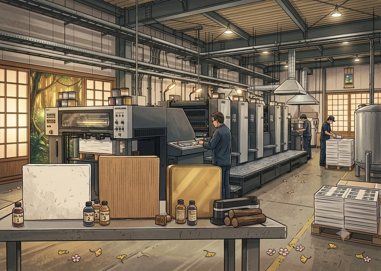
A finished design file doesn't tell you whether it will print the way it looks on screen. That depends on the substrate underneath it.
The same artwork can look rich and saturated on paperboard, then come out flat and muddy on corrugated. A foil stamp that sits crisp on coated paper might not adhere at all on synthetic stock. Substrate choice isn't a finishing detail: it's the decision that determines which print method you can use, how your colors will actually render, and which finishing techniques are even possible.
Substrate Comes Before Print Method, Not After
Most packaging projects start with a design concept and then look for a print method that can deliver it. That order causes problems later.
Paperboard has a smooth, consistent surface that takes ink evenly, which is why offset printing handles it well (fine gradients and full-bleed color reproduce cleanly). Corrugated board is different: its outer liner (often kraft or coated kraft) sits over a fluted core, so the surface isn't perfectly flat. Flute size drives that trade-off directly: finer flutes like E-flute (roughly 90 flutes per linear foot, by industry packaging references) give a smoother, more print-ready surface and better die-cutting behavior, while coarser flutes trade surface smoothness for greater crush resistance and structural strength. Direct printing on corrugated tends to pick up some of the flute's texture underneath, which is why higher-end corrugated packaging is usually litho-laminated instead, printed cleanly on paperboard first, then bonded to the corrugated core. Specialty substrates like synthetic paper, foil-laminated stock, and pearlescent paper absorb ink differently again, and some require digital or flexographic printing to hold color consistently. As a general industry rule of thumb, digital printing tends to be more cost-effective for shorter runs, with offset overtaking it as volume grows, though the exact crossover point depends on the job and the printer's equipment.
The substrate should be confirmed before the design is finalized, not after.
Printability Comparison Across Three Common Substrates
| Substrate | Common Print Method | Printability | Common Finishing Constraints |
|---|---|---|---|
| Paperboard | Offset | High, consistent color, handles fine detail | Thickness affects fold angle; test creasing first |
| Corrugated | Direct print / litho-lamination | Moderate, direct print is sensitive to liner quality | Flute direction limits fold direction and die-line placement |
| Specialty (synthetic, foil-laminated, pearlescent) | Digital / flexographic | Varies by material, proof before committing | Some surfaces resist adhesive; foil stamping needs adjusted heat and pressure |
Where Design Files Break Down at the Finishing Stage
Most substrate-related problems surface during finishing, not printing.
Corrugated board has a fixed flute direction, and a fold line that runs against the flute is prone to cracking. Crease placement in the design file needs to account for flute orientation, not just visual layout. On specialty substrates, surface treatments (a foil layer, a pearlescent coating) affect how well adhesive bonds and what temperature a foil stamp needs. The same die-cutting tool wears differently across substrates, which shows up in lead time and cost over a production run.
Color management follows the same logic. Paperboard's brightness and coating consistency make color reproduction predictable. Corrugated's kraft liner carries a warm base tone, so the same CMYK values print darker and warmer on kraft corrugated than on white paperboard. This is why proofing on the actual substrate matters more than proofing on standard copy paper: the reference is only useful if it reflects the material the job will actually run on.
FAQ
Q1:Can paperboard and corrugated be printed on the same press?
Q2:Does a specialty substrate always mean digital printing?
Q3:How do I know early on if a substrate will support the finishing I want?
The right finishing technique doesn't just look good, it makes your print unforgettable.
Not sure which substrate and technique fit your packaging project and budget?
📩Share your concept with Yeehaa and we'll help you find the right combination before you commit to a production run.
Related Information
CMYK, Pantone, and RGB: Color Conversion Pitfalls and Proofing Tips
How RGB, CMYK, and Pantone differ, why saturated colors shift in RGB-to-CMYK conversion, the gap between Pantone spot and simulated colors plus Adobe's licensing change, with a pre-flight checklist for print files.
Spot UV vs. 3D UV: Comparing Visual Effect, Texture, and Cost
Spot UV vs. 3D UV compared by visual contrast, texture, lamination and registration, and cost, with the common mistakes to avoid when planning business cards, catalogs, and packaging.
Cold Foil vs. Hot Foil: How to Choose by Material, Finish, and Cost
冷燙與熱燙怎麼選?本文從上箔原理、紙張與塑膠的材質適性、立體效果到製版與數量的成本結構,完整比較兩種金屬燙印工法,並整理常見誤區,適合設計師與品牌在規劃名片、型錄與包裝印刷時參考。
Why Does the Same Design Look So Different on Various Papers? The Logic of Brand Perception in Paper Selection
Same design, different paper — wildly different results. A New Taipei printing expert breaks down how coated, matte, and textured papers affect color, feel, and brand perception, plus finishing compatibility (foil stamping, spot UV) to help you choose the right stock.
 中文
中文