

How to Prevent Packaging Color Deviation: The Premium Brand Guide to Print Color Management
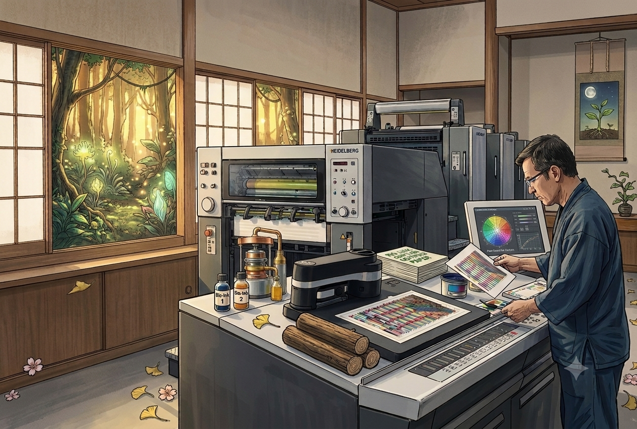
From G7 Certification to 5-Point Quality Control: A Premium Brand Packaging Print Guide
A skincare brand specified a precise shade of Muted Rose Pink for its packaging rebrand. The color was accurate in the design file — yet after delivery, three distinct shades showed up across the same batch. This was not a design error. It was not the printer cutting corners. It was a gap in the color management process.
For premium brands, color is not a decoration. It is a brand asset. This article draws on real print production observations to walk you through how color management actually works in commercial printing — and the five quality checkpoints that matter most for premium packaging and gift box printing.
Why Is Print Color Consistency So Hard? Common Causes of Color Deviation
Achieving stable color across a print run involves managing a cascade of variables: ink batch variation, paper absorption rate, press calibration status, ambient temperature and humidity, and time elapsed between print sessions. When these stack up, the same artwork can produce perceptibly different results across shifts or print runs — even on the same equipment.
In practice, premium brand clients tend to have significantly tighter color tolerance requirements than general commercial print jobs. For annual reports, product catalogs, and luxury gift box packaging, even subtle color drift can directly undermine consumer perception of brand consistency.
💡Expert Note: The Most Overlooked Pre-Press Mistake
Many designers build artwork in the RGB color space and submit files to print without converting to CMYK. The resulting color shift after printing is entirely preventable at the file preparation stage — yet it remains one of the most common sources of print disputes in the industry.
What G7 Certification Actually Means: Not a Badge, a Process Guarantee
G7 — short for Grayscale 7 — is an international color management certification developed by Idealliance. Earning G7 certification means a print facility has demonstrated the following standardized capabilities:
1. Accurate Measurement: Control of the Neutral Gray balance in printed output.
2. Data-Based Calibration: Press calibration based on ICC color profiles.
3. Standardized Proofing: Verification of output against a standardized proofing process.
4. Batch Tracking: Systematic tracking and correction of color drift between print batches.
To deliver on this rigorous international standard, Yeehaa Printing holds G7 color management certification and runs a full Heidelberg press fleet equipped with Prinect Image Control — an automated inline color measurement system. Color calibration runs automatically at every press startup, ensuring maximum stability across long runs and multiple batches.
G7-Certified Color Printing vs. General Color Printing
| Parameter | General Color Printing | G7-Certified Color Printing (e.g., Yeehaa Printing) |
|---|---|---|
| Color calibration basis | Press operator experience and visual judgment | Standardized instrument measurement |
| Batch-to-batch consistency | Susceptible to environmental factors; significant variation possible | Highly controlled with stable cross-batch consistency |
| Acceptable color deviation | ΔE > 5 is common | Strictly managed within ΔE ≤ 2 |
| Proof-to-production match | Varies by supplier; no unified data standard | Standard tracking and correction process; extremely high consistency |
| Color reproducibility across reorders | Difficult to guarantee for reorders months or years later | Achievable via historical data baseline; perfect color reproduction |
Five Quality Checkpoints: From Artwork File to Premium Delivery
Quality control for premium packaging printing is not about standing next to the press and watching. It begins with process design. Here are the five core checkpoints Yeehaa Printing enforces on every high-end print project:
1. Checkpoint 1: Preflight Inspection — Once the artwork file is received, a systematic preflight is run to verify resolution (300 dpi minimum), bleed settings, color mode (CMYK), and font embedding. This is the lowest-cost point at which problems can be caught and resolved before production.
2. Checkpoint 2: Digital and Physical Proof Approval — Before committing to a full production run, a proof is provided for client color and layout approval. For color-critical projects, a physical press proof is recommended as the production color reference — with the acceptable color tolerance range confirmed in writing in the print order agreement.
3. Checkpoint 3: Press Startup Color Calibration — Before each production run begins, press operators calibrate to G7 specifications using optical measurement instruments to confirm ink density and dot gain are within defined tolerances. Only then does full production start.
4. Checkpoint 4: Mid-Run Spectrophotometer Sampling — For long print runs (high-volume printing), periodic samples are pulled mid-production and measured against the approved proof using a spectrophotometer. This confirms color consistency has not drifted due to elapsed time or press temperature increases during the run.
5. Checkpoint 5: Pre-Delivery Visual Inspection and Outgoing QC — A final visual inspection by the quality control team screens out any output affected by mechanical anomalies or operator error, confirming that every piece delivered to the client meets the approved proof standard.
FAQ: Common Questions About Print Color Management
Q1: What is G7 color management certification, and what does it mean for brands?
Q2: What should premium brands prioritize when selecting a packaging print supplier in Taipei?
Q3: What range of color deviation is considered reasonable and acceptable in commercial printing?
"Great print work doesn't happen by accident — it starts with the right conversation."
Got a project in mind? Bring your idea to Yeehaa. We'll walk you through the specs, materials, and production timeline so your next piece gets the same result — or better.
📩 Start the Conversation with Yeehaa
Related Information
CMYK, Pantone, and RGB: Color Conversion Pitfalls and Proofing Tips
How RGB, CMYK, and Pantone differ, why saturated colors shift in RGB-to-CMYK conversion, the gap between Pantone spot and simulated colors plus Adobe's licensing change, with a pre-flight checklist for print files.
Spot UV vs. 3D UV: Comparing Visual Effect, Texture, and Cost
Spot UV vs. 3D UV compared by visual contrast, texture, lamination and registration, and cost, with the common mistakes to avoid when planning business cards, catalogs, and packaging.
Cold Foil vs. Hot Foil: How to Choose by Material, Finish, and Cost
冷燙與熱燙怎麼選?本文從上箔原理、紙張與塑膠的材質適性、立體效果到製版與數量的成本結構,完整比較兩種金屬燙印工法,並整理常見誤區,適合設計師與品牌在規劃名片、型錄與包裝印刷時參考。
Paperboard, Corrugated, and Specialty Substrates: A Printability Comparison
A printability comparison of paperboard, corrugated, and specialty substrates: how material choice shapes print method, color, and finishing limits for packaging projects.
 中文
中文