

Spot UV vs. 3D UV: Comparing Visual Effect, Texture, and Cost
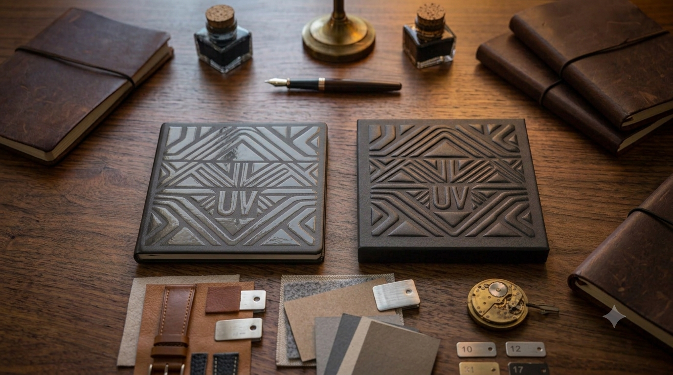
A business card, a catalog cover, a logo, something a designer wants glossy enough to see and feel. At the print stage, it usually comes down to two options: spot UV or 3D UV. Just one word apart in the name, but the effect and the price don't really match up.
Both spot UV and 3D UV add a layer of UV varnish to a specific area, but one leans visual and the other leans tactile. That distinction matters: understanding how they differ in effect, feel, and cost keeps you from paying for 3D UV and ending up with a spot UV result, or spending on texture when all you really needed was a visual highlight.
The Difference Is Thickness: One You See, One You Feel
Spot UV is a thin coat layer of varnish for visual contrast. 3D UV builds up real thickness ,into a texture you can actually feel.
Spot UV lays down a thin coat of UV varnish over a chosen area and cures it, usually paired with lamination. The go-to combo is a matte laminate base with glossy spot UV over the logo or title, so the gloss-versus-matte contrast makes that spot pop. Since the layer's thin, the effect stays mostly visual — it feels a touch smoother rather than raised.
3D UV (also called raised UV or textured UV) builds the varnish up into noticeable height, creating relief and texture your finger can trace. It's usually produced through screen application or multiple varnish passes to build up that thickness, and it can pull off effects like droplets, leather grain, or an embossed look, all without needing a die or embossing plate. Because it takes extra layers and often runs through a screen process, it's slower and costs more.
| Factor | Spot UV | 3D UV |
|---|---|---|
| Varnish thickness | Thin | Built up, with height |
| Main effect | Visual contrast (gloss vs. matte) | Visual + tactile (you feel the relief) |
| Feel | Slightly smooth, near flat | Raised texture |
| Typical process | Inline or on a coating unit | Screen / multiple passes, slower |
| Cost | Lower | Higher |
| Best for | Logos, titles, cover focal points | Premium tactile emphasis |
Substrate and Registration Decide Whether It Works
For either technique, much of the result comes down to lamination and registration.
Both need a smooth, sealed surface to show well. In practice, a film is usually laminated first (matte gives the strongest contrast), then the varnish goes on. Applied directly to uncoated or absorbent paper, the varnish sinks in and both the gloss and the relief fall flat. Confirming substrate and lamination before the run beats trying to fix it after.
Registration matters too. Spot UV has to align with the artwork beneath it; if registration drifts, the gloss lands where it shouldn't, and small text or fine lines give it away fastest. Because 3D UV has height, misregistration shows even more, so leave enough margin when working with fine detail. A few spots that commonly carry UV effects:
.Business cards: logo, name, or tagline; spot UV alone gives a clean contrast
.Catalogs and book covers: title or key visual; matte base plus glossy spot UV is a common pairing
.Packaging: brand name or key graphic; reach for 3D UV when touch matters
.Invitations and greeting cards: small-area 3D UV adds a sense of occasion
Cost and the Mistakes to Avoid
The real question isn't which one is more premium. It's whether this job needs visual contrast or texture.
The most common mistake is expecting spot UV to feel raised. It's mainly a gloss-matte contrast and feels close to flat; for something you can trace with a finger, you need 3D UV. The second is applying 3D UV over large areas, where thicker varnish over more surface drives up cost and a broad raised field can look heavy; it usually reads better on a small focal point. The third is ignoring the substrate, since UV over absorbent paper loses both gloss and relief.
A more practical order is to decide the element you want to emphasize and the feeling you want (seen versus felt), then work back to the lamination and technique. For most business cards and catalog covers, spot UV delivers enough contrast; when the texture itself is the selling point, such as high-value packaging or invitations, 3D UV earns its budget.
FAQ
Q1: How much more does 3D UV cost than spot UV?
Q2: Can you feel a raised effect with spot UV?
Q3: Do I have to laminate before applying UV?
If you're weighing spot UV or 3D UV but aren't sure which fits your piece, share your use case and substrate with Yeehaa and we'll help you find the right combination of effect and cost.
Related Information
Cold Foil vs. Hot Foil: How to Choose by Material, Finish, and Cost
冷燙與熱燙怎麼選?本文從上箔原理、紙張與塑膠的材質適性、立體效果到製版與數量的成本結構,完整比較兩種金屬燙印工法,並整理常見誤區,適合設計師與品牌在規劃名片、型錄與包裝印刷時參考。
Paperboard, Corrugated, and Specialty Substrates: A Printability Comparison
A printability comparison of paperboard, corrugated, and specialty substrates: how material choice shapes print method, color, and finishing limits for packaging projects.
Why Does the Same Design Look So Different on Various Papers? The Logic of Brand Perception in Paper Selection
Same design, different paper — wildly different results. A New Taipei printing expert breaks down how coated, matte, and textured papers affect color, feel, and brand perception, plus finishing compatibility (foil stamping, spot UV) to help you choose the right stock.
【2026 Printing Proof Guide】Digital vs. Press Proof Cost Assessment & 3 Major Defense Lines to Avoid Printing Pitfalls
Digital vs. press proofing: compare costs, learn the 5-step approval SOP, and avoid 3 common printing pitfalls before your next production run.
 中文
中文