

Matte vs Gloss Film: How Your Laminate Choice Shapes Brand Perception
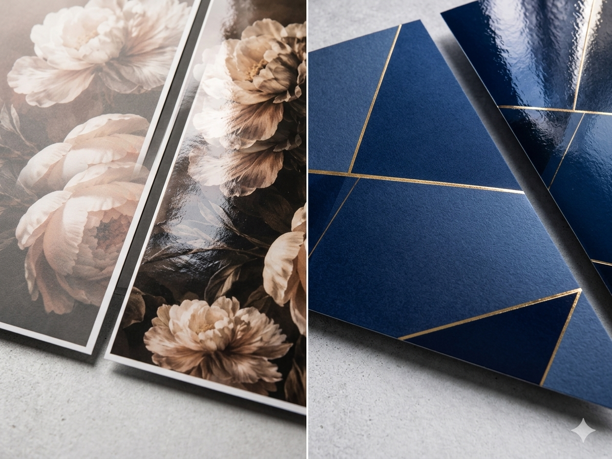
When a consumer picks up a printed piece, the first experience is tactile, not visual.
Matte film and gloss film are the two most common post-press lamination options. The choice may seem like a production detail, but it directly shapes the first impression your brand makes. This article compares both products from a brand positioning perspective to help you choose the right finish.
Yeehaa Color Printing is based in Zhonghe District, New Taipei City, and has served clients nationwide across Taiwan for nearly 30 years, handling hundreds of business card, flyer, poster, and packaging print jobs each month. We consistently see customers choosing between matte and gloss on instinct rather than brand strategy — this article is designed to change that.
Matte Film vs Gloss Film: Two Different Brand Languages
Matte Film
Matte film scatters light evenly across the surface, eliminating strong reflection and creating a refined, smooth matte texture. The visual effect is understated and composed, conveying quality without announcing it.
• Visual effect: Low sheen; colors appear deeper and more composed
• Tactile feel: Smooth and refined; fingers glide with minimal friction
• Ideal for: Premium business cards, luxury packaging, corporate catalogs, gift box exteriors
• Note: On large dark backgrounds, matte film may cause colors to appear slightly deeper in tone — this is a normal optical property of matte film. We recommend requesting a physical sample from your printer to confirm the effect before ordering.
Gloss Film
Gloss film creates strong light reflection, amplifying color saturation and image sharpness for immediate visual impact.
• Visual effect: High sheen; colors are noticeably more saturated, images appear sharper
• Tactile feel: Smooth, polished — suited for image-driven designs
• Ideal for: Promotional flyers, food packaging, product posters, event invitations
• Note: Heavy reflection under bright light can reduce readability in certain environments
Why Does Matte Look More Expensive? The Brand Perception Logic
In our experience, and consistent with industry consensus: low-reflection, lower-saturation surfaces with deeper tones are widely associated with the packaging aesthetics of luxury brands — evoking a sense of scarcity and craftsmanship. High-gloss surfaces, by contrast, are more readily associated with mass-market consumer goods on retail shelves.
Gloss film has genuine strengths. The key is understanding what each finish communicates, and aligning that with your target audience.
| Industry / Use Case | Common Choice | Rationale |
|---|---|---|
|
Luxury brands / Premium gift boxes |
Matte + Spot UV |
Emphasizes craftsmanship; touch is part of the brand language |
|
Food / Consumer goods packaging |
Gloss |
Amplifies color vibrancy, appetite appeal, and shelf presence |
|
Corporate catalogs / Business cards |
Primarily matte |
Communicates professionalism; comfortable for extended reading |
|
Promotional DM flyers |
Gloss |
High-volume, cost-efficient, strong visual impact |
|
Art exhibitions / Design-oriented print |
Matte or specialty substrates |
Consistent with artwork aesthetics; avoids glare interference |
Cost and Process: Practical Details Before You Order
Spot UV (Selective Gloss Coating)
A popular strategy is the matte base with selective Spot UV combination: applying a matte laminate overall, then adding a gloss UV coating to specific graphic elements such as a brand logo or key visuals. This creates high contrast and tactile richness. It is widely used in business card and packaging printing, with higher cost but strong results.
Color Management and Proofing
The color and texture of a laminated piece can differ from what you see on screen. Physical proofing is a separate paid service. For large-volume orders or color-critical work, the cost is justified. For smaller print runs, the practical alternative is clear pre-press communication — discuss your color expectations with your printer before ordering and let an experienced team calibrate the output settings accordingly.
Matte vs Gloss: Complete Comparison Table
| Comparison Factor | Matte Film | Gloss Film |
|---|---|---|
|
Sheen level |
Low, light-scattering |
High, strong reflection |
|
Color rendering |
Deeper, more composed tones |
Vivid, high saturation, sharp contrast |
|
Tactile feel |
Smooth, refined, low-friction |
Smooth, polished |
|
Brand tone |
Premium, understated, professional |
Energetic, accessible, mass-market |
|
Post-press compatibility |
Works with Spot UV, foil stamping |
Works with Spot UV |
|
Best for |
Business cards, catalogs, luxury packaging |
Flyers, food packaging, posters |
|
Relative cost |
Slightly higher (Spot UV extra) |
Standard pricing |
FAQ
Q1: Which costs more — matte film or gloss film?
Q2: My design has a large, dark background. Is matte film a good choice?
Q3: Should poster printing use matte or gloss film?
"Understanding your finish options is the first step to choosing the right solution for your budget."
Not sure which lamination is right for your project? Share your use case with the Yeehaa team — we'll help you find the right finish and workflow combination.
📩 Contact Yeehaa Printing. Based in New Taipei City, serving clients nationwide across Taiwan.
Related Information
CMYK, Pantone, and RGB: Color Conversion Pitfalls and Proofing Tips
How RGB, CMYK, and Pantone differ, why saturated colors shift in RGB-to-CMYK conversion, the gap between Pantone spot and simulated colors plus Adobe's licensing change, with a pre-flight checklist for print files.
Spot UV vs. 3D UV: Comparing Visual Effect, Texture, and Cost
Spot UV vs. 3D UV compared by visual contrast, texture, lamination and registration, and cost, with the common mistakes to avoid when planning business cards, catalogs, and packaging.
Cold Foil vs. Hot Foil: How to Choose by Material, Finish, and Cost
冷燙與熱燙怎麼選?本文從上箔原理、紙張與塑膠的材質適性、立體效果到製版與數量的成本結構,完整比較兩種金屬燙印工法,並整理常見誤區,適合設計師與品牌在規劃名片、型錄與包裝印刷時參考。
Paperboard, Corrugated, and Specialty Substrates: A Printability Comparison
A printability comparison of paperboard, corrugated, and specialty substrates: how material choice shapes print method, color, and finishing limits for packaging projects.
 中文
中文